Naturally the project also needed an AI generated animated logo! I used Midjourney to create the logo and After Effects to add in the text and handle the animation.
The final logo animation. It is still missing audio, which might change the timing a little bit. The animation is created from a logo generated by Midjourney V4.
Prompting
The final logo was created by Midjourney. As usual, I went with the most obvious prompt: “logo for adventure game called echoes of somewhere”
This prompt generated results like this


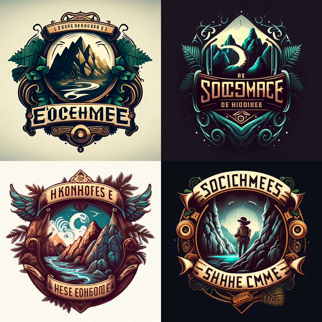

I really did not want to overthink it, I just chose the logo that made the most sense for me at the time.

It has been a minute since I generated the logo and I can not remember why I ended up with this version. But it must have been the fact that the font was very striking and there were 3 lines of text.
Photoshop
I took this logo to Photoshop and simply painted over all the text. I, however did not create the text in photoshop, because I wanted it to be non destructive. Meaning that I wanted it to have somewhat complex styling but remain editable so that I could change it later if required. And I also had an idea for the logo animation that required editable text.

After Effects
The completed logo main composition looks like this in After Effects:

After effects is better known as a video editing / VFX / motion graphics software, but it is very usable as a still graphics production / editing suite. I quite often use it for that purpose!
The main composition contains just the logo without the text, one text layer for the adventure games anthology bit and 2 precompositions for the logotype and the series 1 text.
I used recompositions because I wanted to keep the comps clean and add some effects for the fully dressed up texts.

The series text is simply precomposited in order to rasterise the text for the mesh warp effect. It is a dead simple styling using only the good old bevel and emboss layer style.
The Main logotype is a bit more complicated.
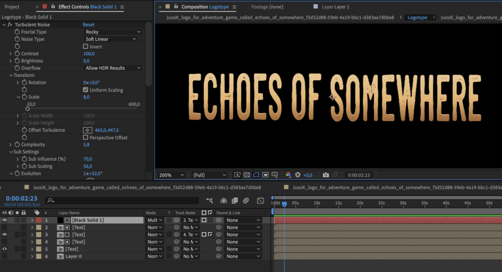
I wanted to recreate the style Midjourney generated for the logo. It meant rough edges, black dotting inside the letters and a gradient with some rimlighting.

The rough look is achieved by an effect called roughen edges. it can be used to add randomness to any alpha edge. The colouring done with a black and white gradient that is then colored by a tritone effect.
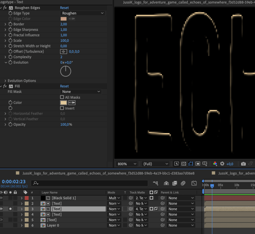
For the rim light, I did not use a bevel and emboss effect this time, but I created a few copies of the text, used one of them as a subtractive mask on the other and simply added a color fill to make it appear bright.
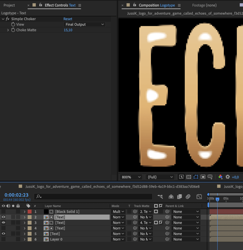
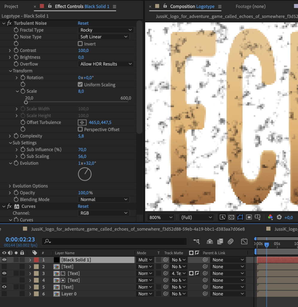
The black dotting is a combination of first creating a mask layer of the text so the effect is only isolated at the very centre if the letters.
Then a simple noise is masked into this mask. This adds some nice detailing in the text.
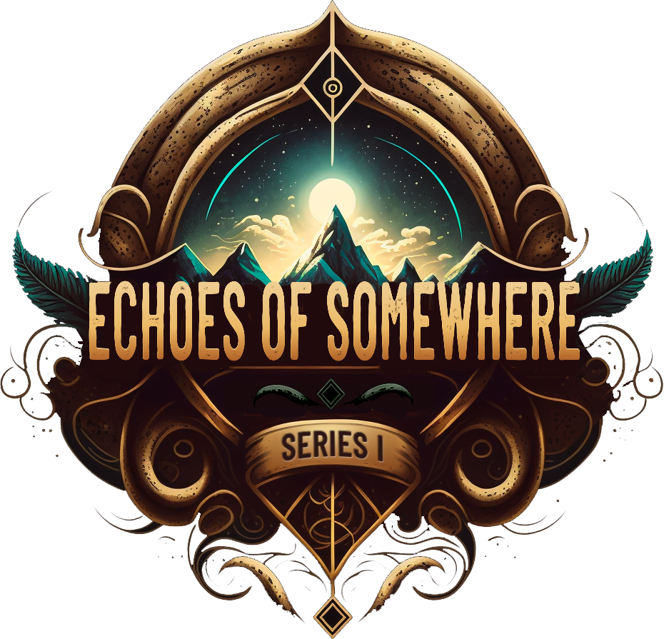
That is it for the logotype. The end result is the logo I used for the project.
The Animation
The design of the logo pretty much dictated the animation. Again, I did not want to reinvent the wheel or do anything wild. The logo spoke to me and I listened.
My script for the animation was pretty much:
- Curve details growing from nothing
- Leaves fanning out
- Framed image has some parallax
- “SOMEWHERE” text changes to episode name
The animation layering
The rest of my plan was just to take the logo into photoshop, chop it up into as many pieces as possible, then take these into After Effects and add animations to every layer separately and see where that takes me. I have so little free time to use for this project I really need to cut all corners and just do these wild leaps of faith. Design stuff while working on it and then simply call it final..
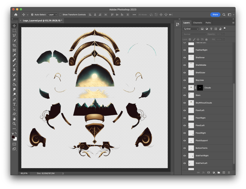
I relied heavily on Photoshop’s content aware fill for clearing up the layers of the little landscape in the logo. It worked amazingly well to erase all the curls and stars and mountains and clouds from the sky for me to be able to add parallax later on.
But the tool I used the most was simply polygonal lasso tool. I was left with a bunch of some pretty sharp edges, but I was pretty sure no one would notice those in the final product.
The animation tools
I created most of the appearing animations with these tools in After Effects:
- Stroke effect
- Puppet tool
- Radial mask
- AutoFill
For my simpler elements I used the stroke effect. What it does it it uses a curve added to the layer as a stroke source. Then the stroke can be used to mask the layer itself and the end points of the curve can be animated for a very simple draw on effect. By adding some puppet tool animation on top of the stroke effect allows me to make the twirls feel like they are growing and flowing, instead of just simply being revealed by a mask.
This simple trick was used for a bunch of the small curls.
For some of the bigger shapes, like the mountains and the large arches on top, I used some radial, soft masks that I simply scale up to mask out the shapes.
The most advanced tool used was by far AutoFill. It is a third party plugin that uses a sort of fluid simulation to fill out a shape. It does a very good job at filling complex shapes and even uses speed masks to allow for uneven fill on a flat area, which is very cool. If you find the tool interesting, you can find it at https://aescripts.com/autofill/
Even though advanced, it is very easy to use! I simply enabled it on the layers I needed to and chose a starting point and set the layer as its own speed mask. By using the layer as its own speed mask, the fluid movement on the graphics followed the curl shapes more closely. I did not need this to be perfect,it just needed to look elaborate and complicated.
Direct video link
After I had animated every single element to appear, I added some scaling so the logo appeared to exist in depth somehow. And it would have movement scaling in and scaling out, adding some dimensionality and additional movement. This made the animation look better.
After the logo was animated I added some custom blur based exponential glow on the image to tie everything together and some color grading using Film Convert Nitrate.
For the text animation at the end I simply have a null object with a bunch of words parented to it and then the texts are masked by a feathered rectangle.
The logo animation was all in all a pretty straightforward process. I did not overthink it much. Just went with my gut.
After looking at the animation for a few days, I begun to feel like the text animation was too clunky and the middle part of the logo was empty for way too long. So I retimed the text andused After Effects’ per character 3D text anination tools to reanimate all the texts.
After the text animations were changed, I felt the logo needed some moving lights / reflections on top, so I precomposited the logo and usedit’s red channel to add some additive turbulent noise on top.
As I now had the whole logoanimation precomposited, I added a second copy of it, animating 2-3 frames before and with the brightness cranked trough the roof to add these light gleams at the edges of the growing bits. It realyl made the animation pop in a way it previously did not.
I am quite happy with the end result. It does it’s job pretty well. It can be used for any game in any genre or setting in the anthology series. And with proper sound design it will be even better!




Leave a Reply