
In part 1, we used Midjourney and Photoshop to create the 2D locations, Now it is time to merge them together – in 3D.
The part 1 was all about the 2D workflow, how to edit Midjourney generated images in Photoshop (beta). You can read it here before continuing with this part 2.
People were really into the generative tools in the new Photoshop beta. I posted a few tweets and especially the pixelart one got a lot of traction!
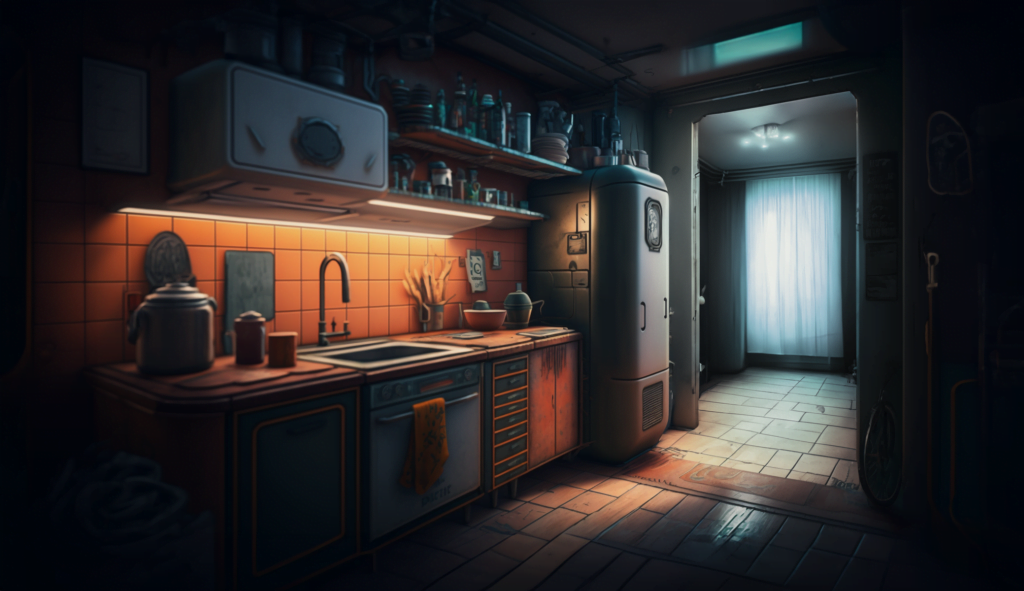
But, now on with the game protagonist’s home apartment!
Planning
A world about the location room selection. I knew that I needed 2 rooms that I could connect. I wanted to see the doorways in the image generations for the player to be able to click on them.I am not a fan of having the player walk towards the bottom edge of the screen to get to a new location. I think it is unclear when you do not see the pathway in the game screen.

It took me a while to get images I liked and in the end I did have to create the connecting pathways in Photoshop (beta) using generative fill on top of the Midjourney images.


I made my life a little easier, by creating the kitchen location in a way that hid the other room behind a wall. I was sure I could have the kitchen back wall be visible from the lobby/bedroom, but I did not want the player to see the lobby, as I was unsure if the location would hold up when seen from a steep off angle.

The kitchen was already in an angle that would lend itself very well to being seen from another room! I also chose images that I could see the camera moving between with a smooth leap without having to clip trough walls or move into the image too much.

I did not do any sketching or planning for the apartment layout beforehand, but based on my 3D modeling experience I always tried to avoid any rooms that would end up being problematic.
Shadow painting
Before moving on to the 3D modeling step, it was time to make the shadow passes of the original images. These shadow passes are then masked with a custom shader code to apply shadows on the image that do not look out of place.

I do this step in Photoshop. First, I add a new layer, then duplicate the original image, apply high-pass filter on it and set it to overlay mode with clipping mask set to the newly created layer, which is in turn changed to darken mode.

Then by simply using the color picker to select nearby shadow values I paint out the highlights and lit areas in the image. Sometimes when you see the shadow pass image in use in-game, you realise that the shadows you painted are too dark. This is what happened in this location as well, so I had to do this shadow pass paint a couple of times to get it perfect.
fSpy + Blender
After all the 2D steps are done, it is time to model the locations. As always, I start by reverse engineering the camera in fSpy. When you have a 3D camera that goes with the image, it is very easy and quick to create simple 3D mesh of the location for 3D projection.


This location, along with the fluid sim factory scene, were a bit different: in this scene the camera would be moving! Because of this parallax shift visible for the player, I would have to add in a little more detail than usually. Normally I only need to model detail to where the shadows fall on the environment and on parts that occlude the player. But this time I also needed to make sure the parallax shift would look somewhat natural.


Because of this added requirement, modeling this 2 room location took a couple of hours, maybe 5 or 6? I would have been a lot faster, if it was not for Blender. I am still learning it and simple things like merging vertexes requires me to do a google search. Having 20+ years of 3D experience with other software makes learning Blender so hard! That software is pretty unique and simply weird.

I did do the separate texturing for the fridge insides in Modo. I simply did not want to waste an hour learning UV mapping in Blender when I could do it in Modo in 5 minutes. If Modo had the same project from view UV functionality where it does not fix the aspect ratio, I would be using modo for everything, the lack of this simple feature caused me to cut off my maintenance licence and go full Blender – even if it is taking me a while to learn it (that and the lack of native Apple silicon build).
Unity
But finally I had all the pieces of the puzzle. it was now time to set it all up in Unity. I had not tested this before, so I simply hoped that the scenes would match, both in color and in shape.
I was extremely lucky, albeit well prepared, and the rooms matched each other almost perfectly!

I added in all the usual sugarcoating: painted shadows, depth of field, grain, ambient lighting, fog and matching 3D lights to blend the character as well as possible.
Now it was on to the special sauce of this scene: the combined locations.

This was pretty easy to set up actually. I had these 2 rooms already laid side by side. Even though they were both from a different camera angle, using fSpy to sniff out the vanishing point brings them both into “normalised” 3D space. Meaning that once I have modelled the locations, they are not all rotated weird, but actually line up perfectly!
For navigation, I use invisible cubes instead of the actual room mesh, as I want to precisely control where the player can or can not walk to and how close they walk by different walls or props when navigating these tight spaces.
Camera move
The camera movement that would appear in the scene would be a dolly and a pan. The combination of these 2 would be better than a simple dolly, as it would expose the projection nature of the scene more. By having the second location painted at an angle would help by reducing the parallax of the transition a little bit. You can still see some stretching in the lobby scene, but that is something I can fix in the future by painting in some obstructed areas and adding more geometry.

I also added some black cubes in front of camera in the seam. These boxes would imply some cabinetry or other details that whip past the camera. These were necessary to hide the locations when they are the most stretched on the sides of the screen.

The camera move would be triggered by hit-boxes. Using the doorway would force the character to walk to the other room, and when entering that room the player would hit an hitbox and the camera would follow. I wanted the move to be predetermined like this, instead of a free following camera along a set path to keep the images more static for better point and clickery.
I topped it all with a unique post process volume with massive vignette for this scene. The vignette really helped tie the location together and make the transition look smoother.
Scene interactions
In addition to the camera move, this would also be the first location with actual player / environment interactions: opening the fridge!
This feature is simply done by animating only the fridge door and using IK (inverse kinematics) to attach the player hand to the handle. The player itself is not running any animations, it is simply driven by the animating door.

I am trying to do as much of the scripting of the game using Adventure Creator’s tools. If I need to run custom code, I program plugins / additions for Adventure Creator.
In the past I did custom programming directly into AC source, but I have stopped doing it and use their API instead. As upgrading a custom Adventure Creator to the latest version was always a hassle.
This was a fun little experiment! And one that was just as successful as I had hoped! Now I have a much better understanding of what it takes to combine multiple 2D background into a larger location. I am much more confident in adding more of these in the future.
The next challenge would be to seamlessly blend from one open space (like a store front) to another with 2 camera projected scenes like this. I have no idea how to marry those things together. Even if it is easy in 2D, how would I carry that over to the 3D scene I do not know. Time to find out!


Leave a Reply